Need help to make better presentations? Thanks to this compilation of tips and tools, teachers can prepare more attractive online presentations which include images, videos, and audio, and everything you need to make the perfect online presentation. Some even allow several users to work on the presentation at the same time, promoting collaboration and teamwork.
A few weeks ago here at Pedagoo we talked about the most important ICT tools for teachers. Now we want to focus more specifically on online presentations and the incredible benefits they can have during class.
The best tools to create online presentations for your classes
- PowerPoint: the latest version, which can be purchased with Office 2013, supports a larger number of media formats and HD content, and the ‘Play in the Background’ feature allows you to play music while slides are being shown.
- Prezi: dynamic, original, intuitive… The user works online and has at their disposal numerous templates and fully editable support materials. Prezi is based on an extensive workspace in which the elements are located in free form, setting you loose from the obligation to use the classic sequence of slides. There is an option for students to collaborate in real time and presentations can be posted online or shared on social media.
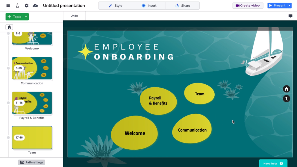
- Genially: this tool allows you to create illustrative content in which participation, communication, and learning are the protagonists. Its multitude of animated effects and creative templates have several advantages: didactic lessons can be more interesting, and teachers can turn their ideas into interactive experiences. In addition, they may include other elements such as infographics or internet information with direct sources, helping you to save time and effort while delivering a better end product.
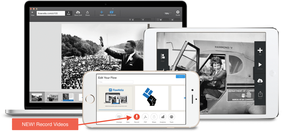
- Flowvella: with this exclusive application for iOS, teachers have numerous tools to tell a story through images, texts, videos, links, and fun transitions. With the online presentation models covered by this program, you can not only create visual exhibitions, but also listings, albums, and digital brochures.
5 Tips to Improve Your Online Presentations
Online presentations are often monotonous for some students. If you’re a teacher looking to break the mold, use the following tips to improve the design of your presentations:
Choose an original template that’s geared towards your content
The PowerPoint, Keynote, and Google Slides tools incorporate templates so you don’t have to start the presentation from scratch. However, as they are so popular, they end up being very repetitive… Do you want to surprise your students? In that case, use a unique design customized to your message, choosing a template pre-designed by other professionals.
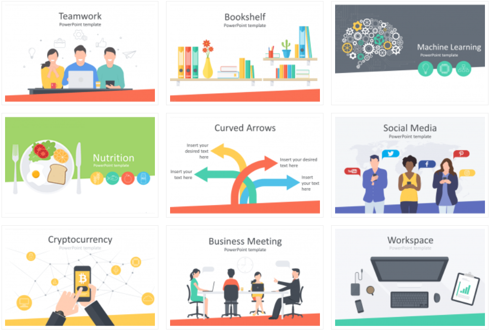
On websites like Wise Templates, you can find free PowerPoint templates that have been designed to help you stream different types of content (education, technology, food, environment, etc.) through the use of graphics, infographics, maps, and organization charts.
These templates are fully customizable and in some cases, if you are going to make commercial use of them, only attribution to the author is required by linking to the download page.
Use a font that catches the eye
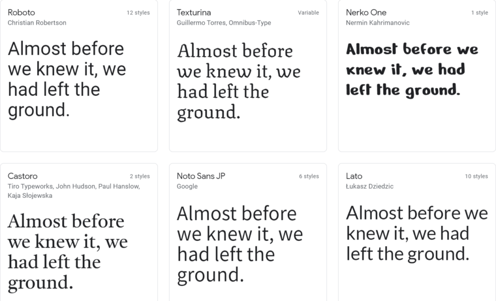
Standard fonts such as Times New Roman, Arial, Calibri, and Helvetica have been seriously overused. Looking for a way to surprise your students? Use an original font in your design that matches the content to give the presentation a unique look.
In fact, a font can improve the readability of a text, communicate emotions, or even build trust in the reader.
Some less frequent fonts are Roboto, Oswald and, Titillium, which give a very professional appearance. In addition, you can find other original fonts on Google Fonts. On this website you can choose from more than 600 families from different sources, totally free, to customize your presentations.
Use icons to improve your communication
One way to improve an online presentation is through the use of iconography. In presentations, icons can be used to complement titles and themes, break up the monotony of text, and solidify what you are trying to convey. When your audience sees an icon, they not only see that image, but also quickly identify what it represents.
If your presentation has a list of points or stages, use icons instead of enumeration points. Be creative and look for an icon that represents each point. To find a variety of free icons, you can visit websites like Flaticon.
Pay special attention to image quality
In recent years, websites dedicated to photography have appeared where thousands of photographers upload their work, in high definition, entirely free to use for anyone who wants to do so (for commercial purposes as well as personal). The images are classified by themes, are high resolution, and of much higher quality than the photos you’ll find in commercial image banks. These photos allow you to give a very professional touch to your presentations.
Some of the best places to find images are Unsplash and Pixabay.
Don’t overdo it with animations
Though they are fun to include, animations are often not well received by people who watch a presentation. Despite being very popular in PowerPoint and other apps, we advise you to use them sparingly as they tend to distract your audience from the explanation, rather than engage them in the content.
Finally, remember that a good design supports a good explanation, but can’t replace it! Focus on delivering a logical presentation that has a beginning, a middle, and an ending. It should explain what the problem is, why it’s important, and detail the solution.
Did you like our article? Would you add any other advice? Leave us a comment below!


